
Vegan Pecan Bakery
Vegan Pecan Bakery is a vibrant, hip and indie brand that provides a variety of perishable pastry, desserts and drinks made primarily from pecans.
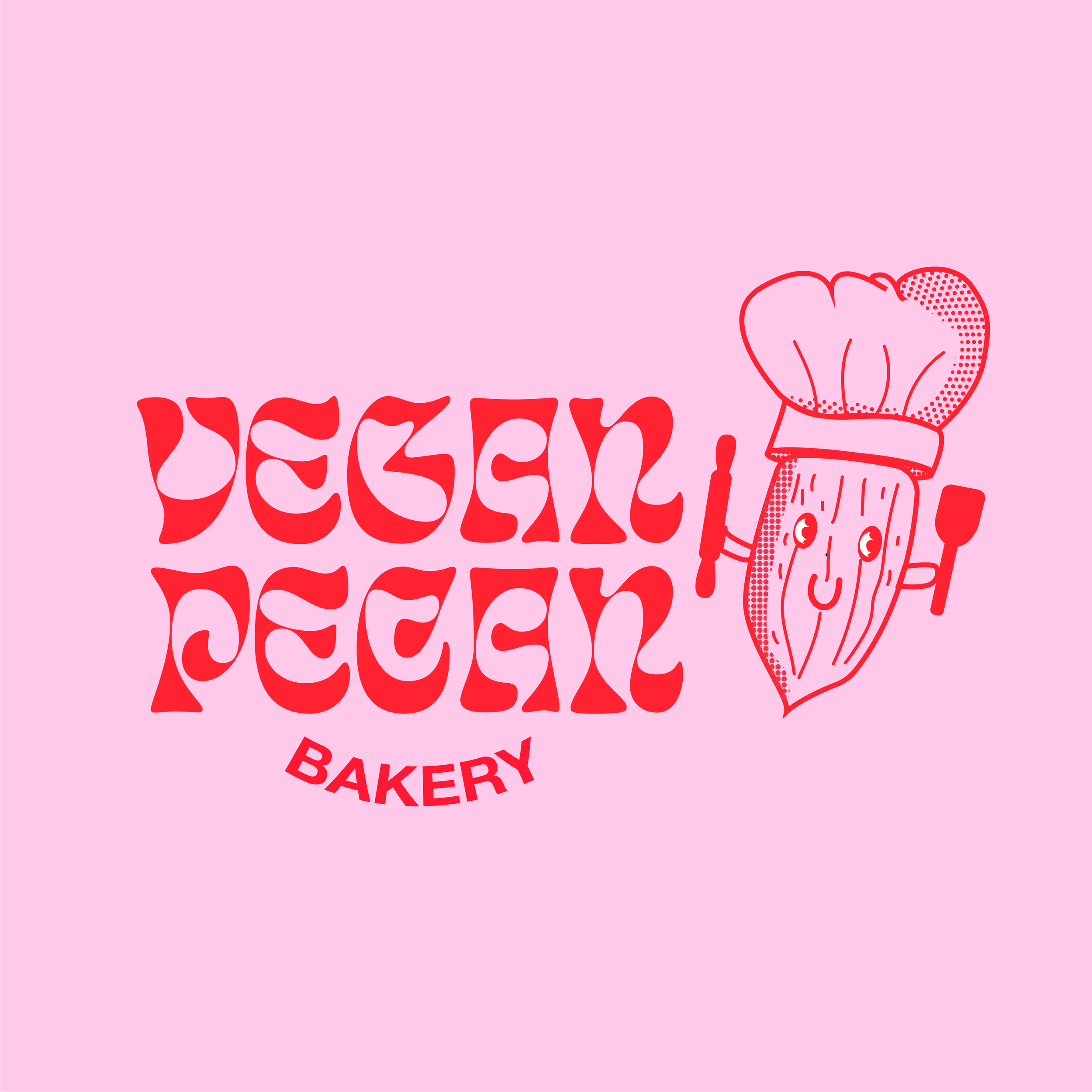
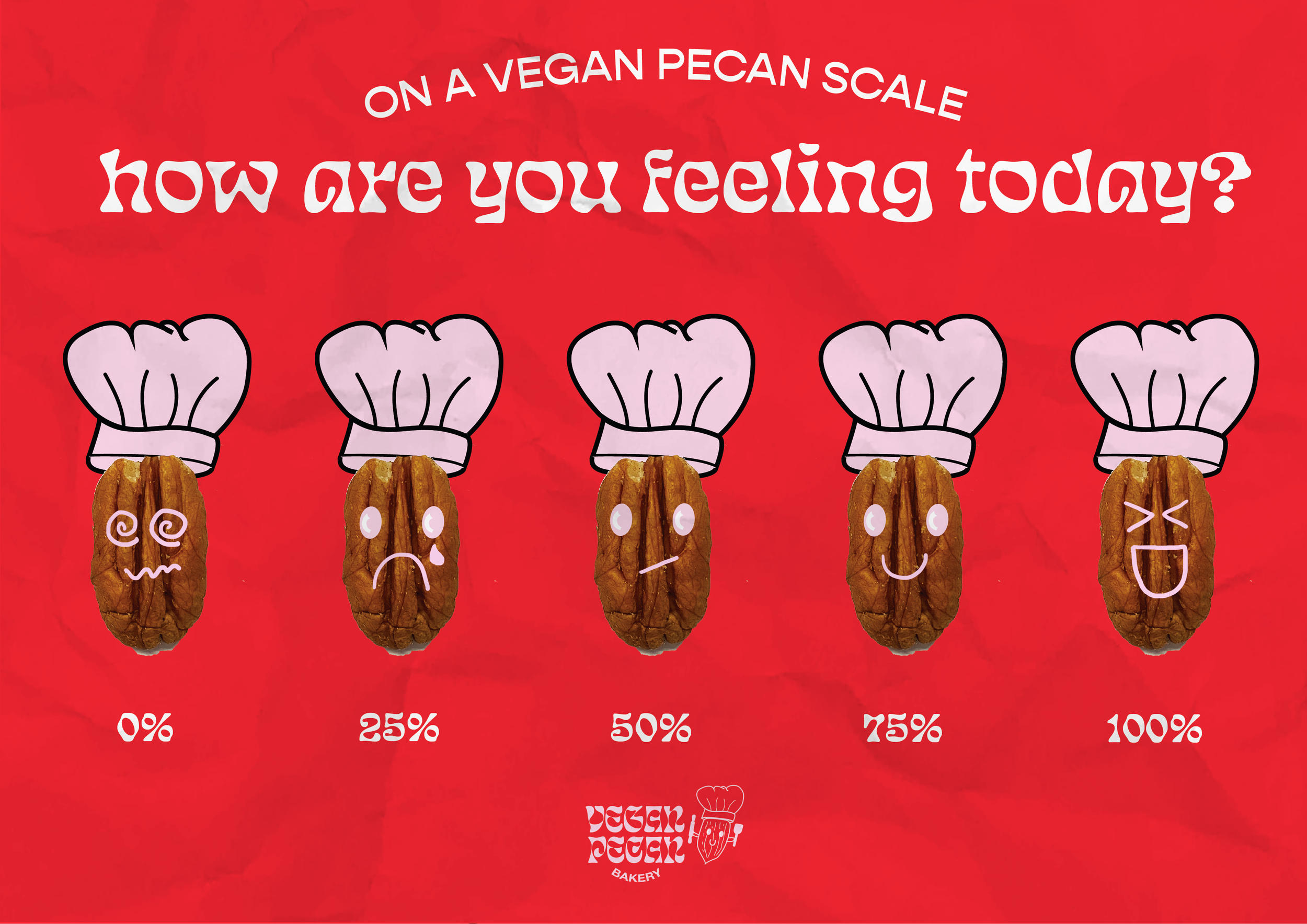
With a Pecan mascot being the central element across the branding along with funky typefaces, the branding depicts a funky and cool energy to the audience.
Accompanied by the branding are the marketing collaterals spanning three advertising mediums: print, traditional and digital.
Project
Year
16/07/2022
What is Vegan Pecan?
Vegan Pecan Bakery is a delightful, vibrant and indie brand that provides a variety of perishable pastry, desserts and drinks made primarily from pecans. Vegan Pecan is simply more than a bakery, it is a hidden gem in the heart of the city where people can escape from the hustle and bustle.
Our purpose is to create a safe space for the community to explore a wide range of vegan products while having a relaxing time with family and friends.
The branding aims to depict a catchy, fun and quirky image towards the audience to gain attention as well as develop an outstanding impression in their eyes. Moreover, the designs are published to create memorable and lasting memories when customers visit the store, making people want to purchase the products and engage with the brand.
Target Audiences
Vegans
have a sustainability lifestyle but find it hard to make vegan desserts, willing to try anything new
Dessert Lovers
sweet tooth who enjoy a decandent treat
Branding Process
-
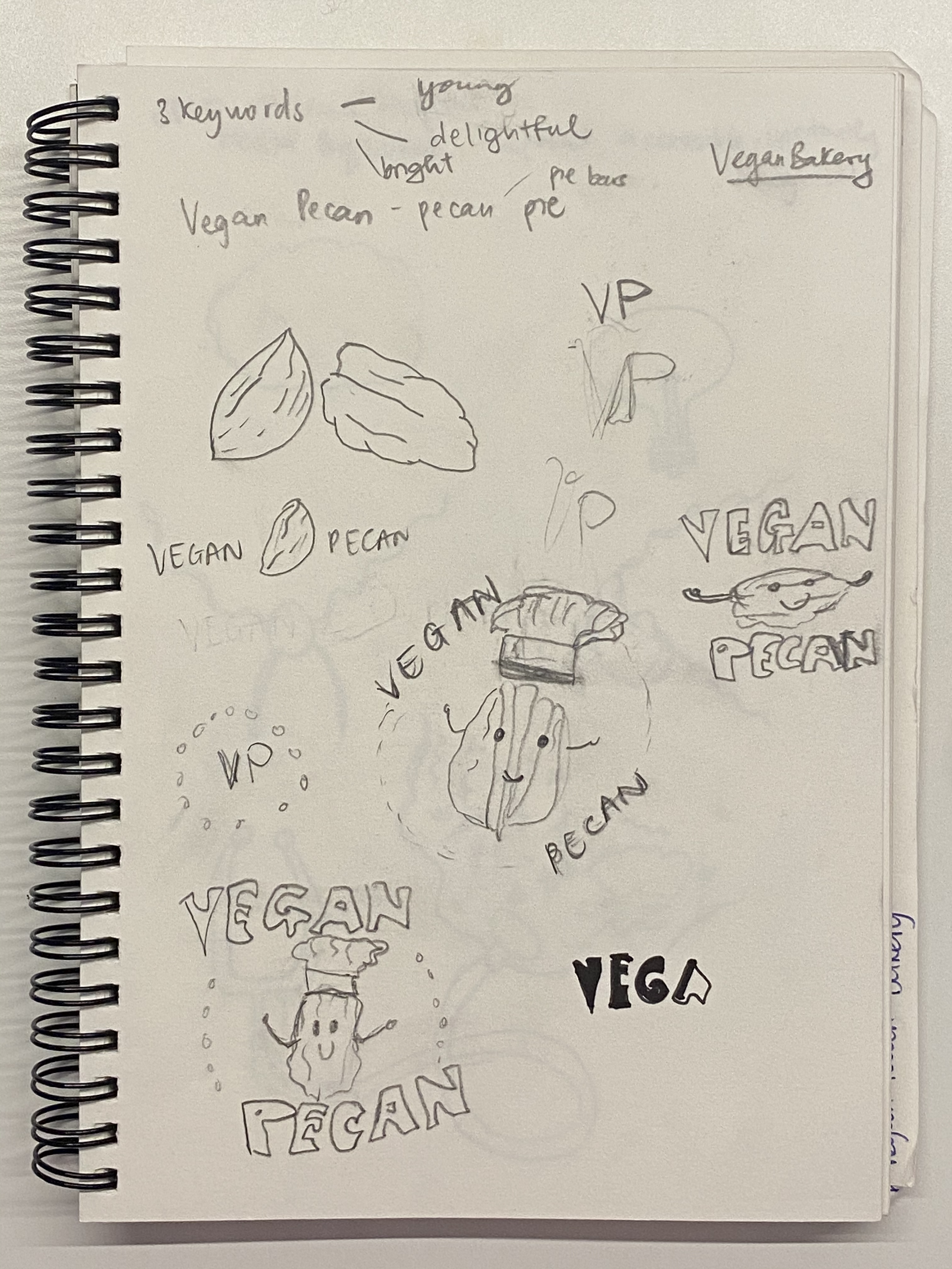
Ideation
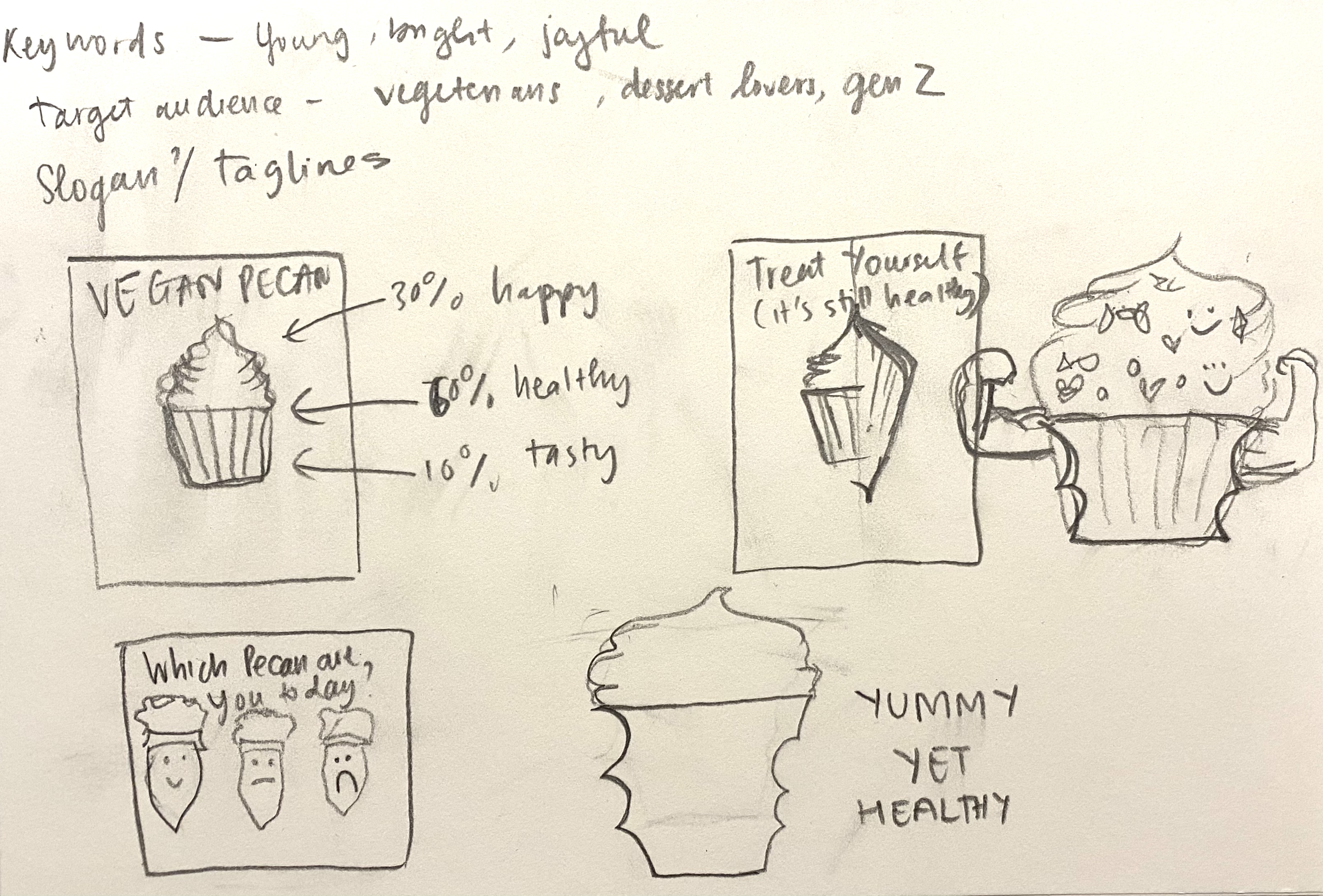
Firstly, I sketched as much as I could after brainstorming the keywords that Vegan Pecan would central itself in, which were: “young”, “vibrant” and “joyful”. I was certain that my outcome will be a mascot logo.
-
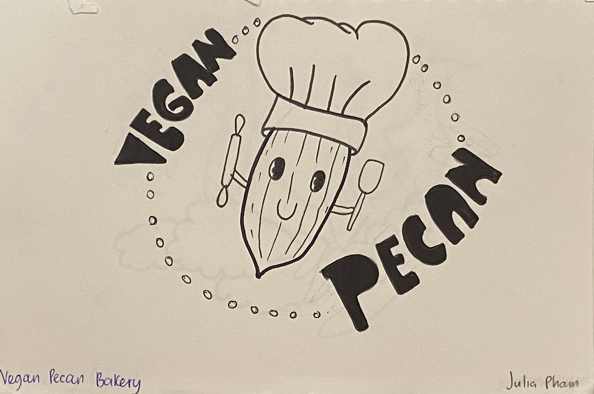
Finalised Sketch
After carefully deciding to take the pecan as a central mascot of the brand, I started to refine the sketch with ink after shortlisting some great combinations between text and illustrations.
-
Illustration Attempts
After finalising the mascot sketch, I moved on to the vectorise stage. I tried different color combinations of the shape and the stroke to find out which delivery works best regarding visual communication.

-
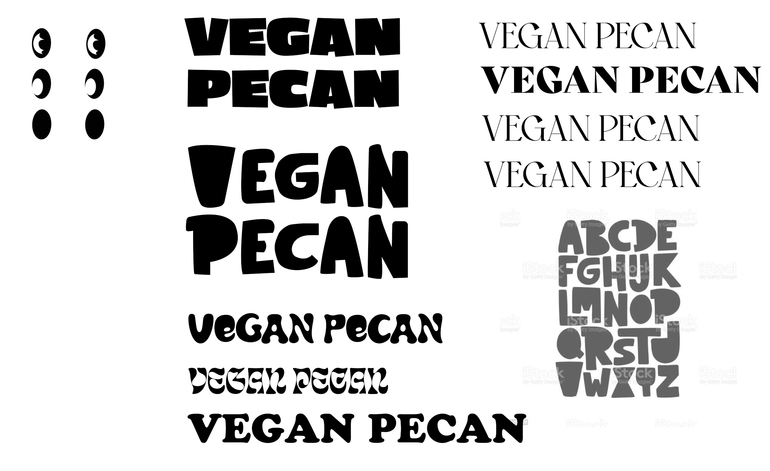
Experimenting Typeface
The next step is discovering typefaces. For this stage, I undertook trials and errors of several typefaces that stood out to me. There was one that I even sketched myself, but I ended up choosing Eckmanpsych and Helvetica.
Branding Identity

Primary Logo

Secondary Logo


Submarks
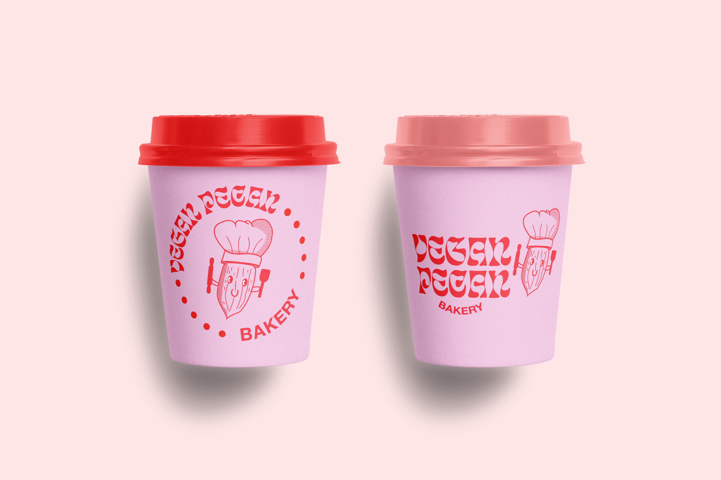
Paper Cup Packaging

Stickers
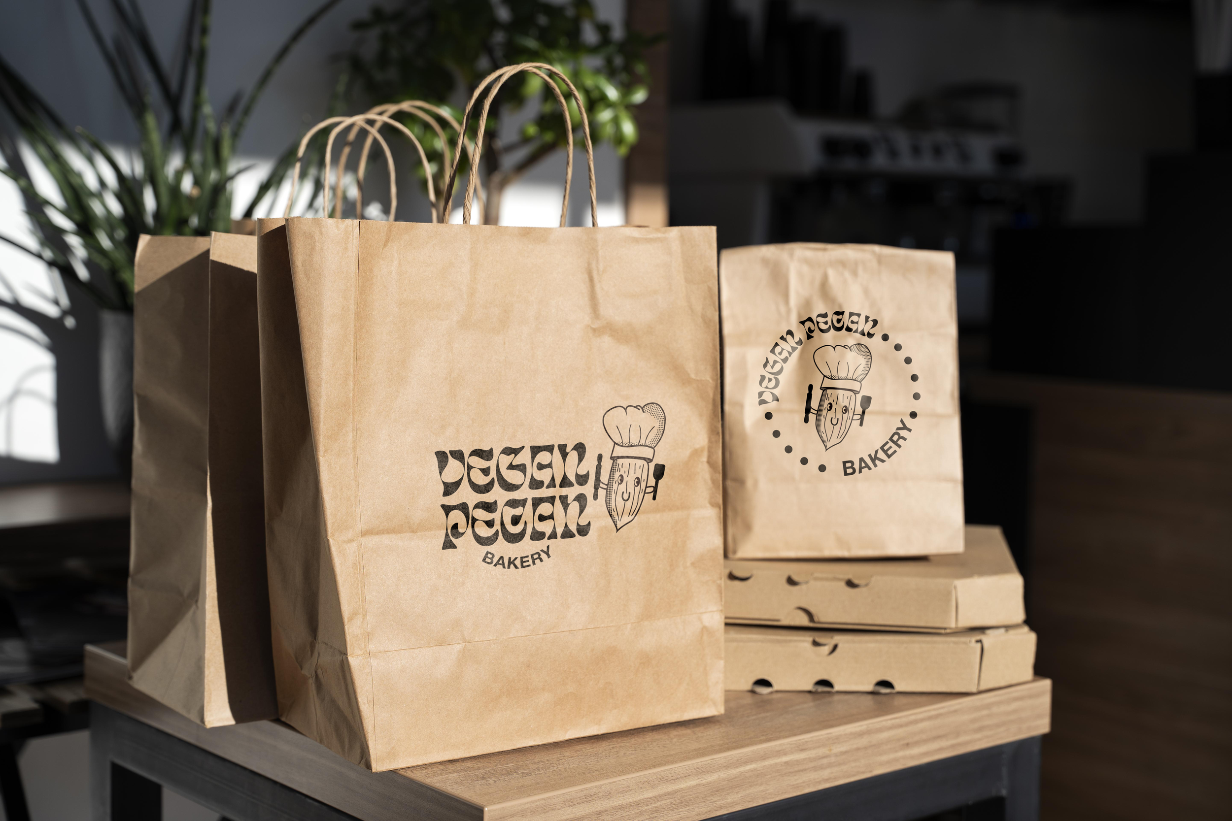
Paper Bag Packaging

Bread Packaging

Loaf of Bread Packaging
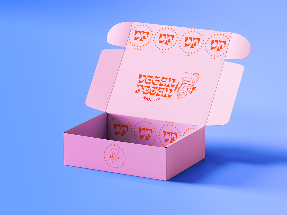
Pastry Box Packaging
Rhetorical Campaign Process
-
Initial Skecthes
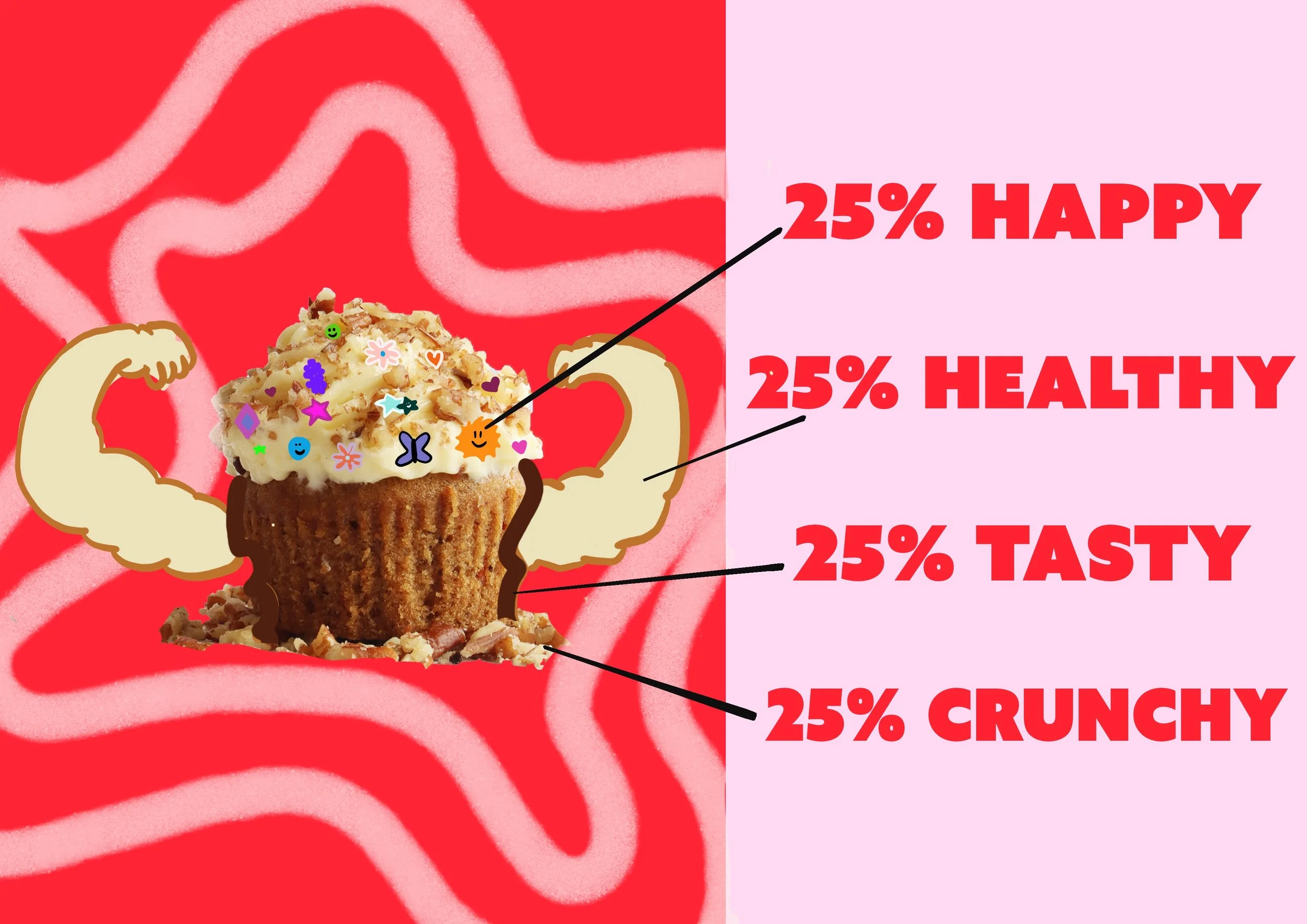
Initial sketches while brainstorming in tutorial sessions. Campaign is set to focus on physical and mental health of customers. Products and users are put centered.
-
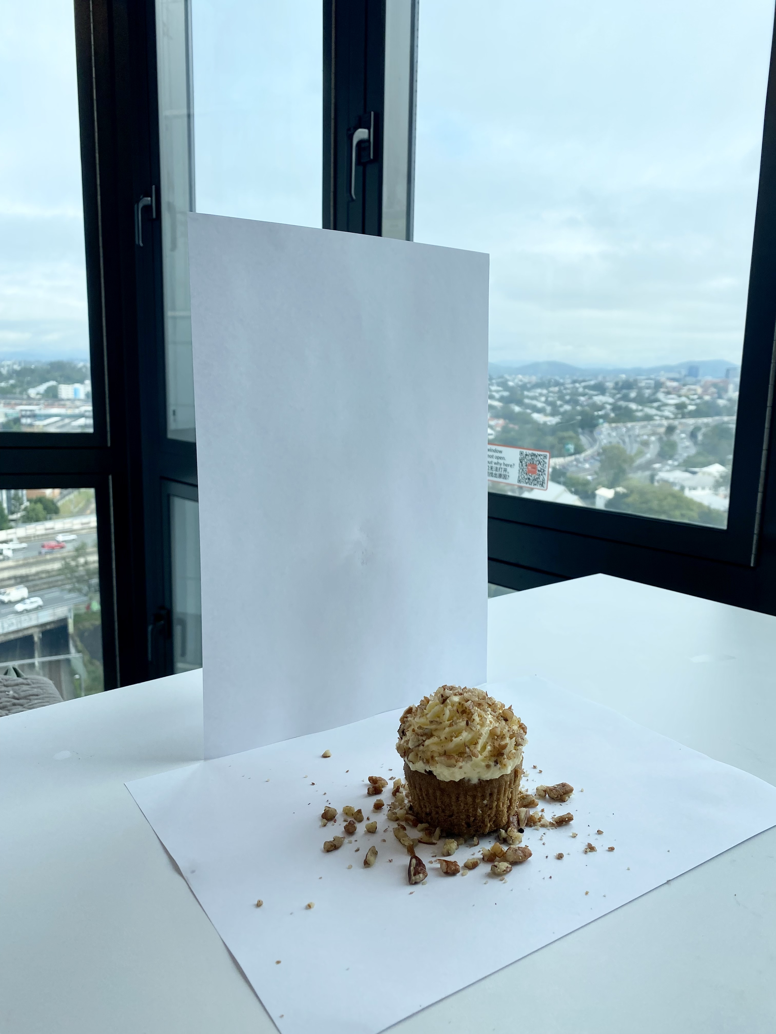
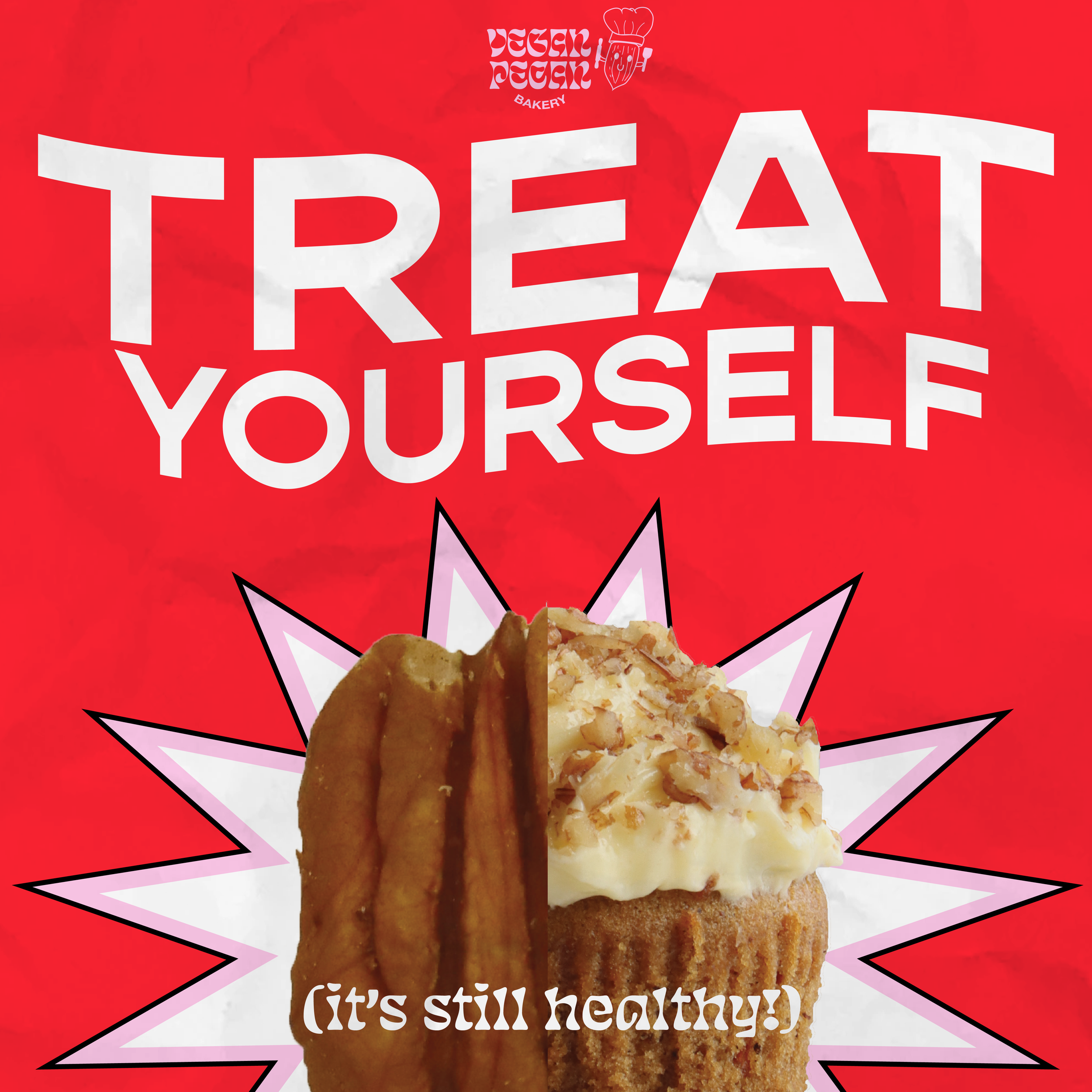
Pecan Cupcake Photoshoot
Home photoshoot set up, involving two blank papers with a bottle backing up from behind. The main element here is the cupcake, which would be removed the background later.
-
The Chosen Image
One of the raw photos before getting edited in Lightroom and edited in Photoshop. I ended up using this version since the lighting is adequate, requiring less retouching.

From Drafts to Product

Print Poster
Social Media Post


Food Truck Banner
Marketing Mockups

Print Poster

Food Truck Promo

Social Media Post