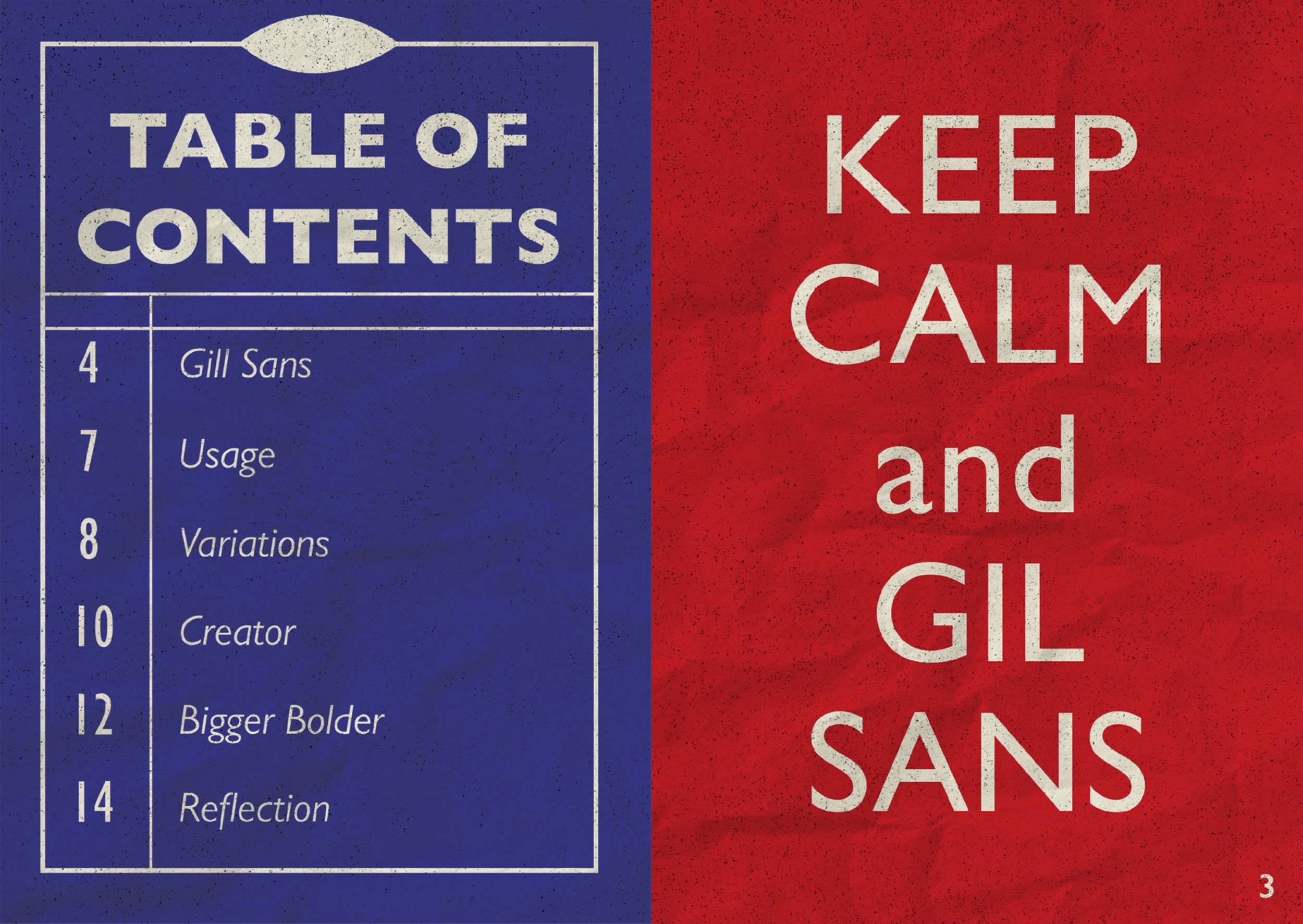
Gill Sans Zine

This zine is a journey discovering the origin of the classic typeface - Gill Sans. All fundamental aspects such as the development, the artist, the history, the usage and the specimen of Gill Sans are covered within the zine.
The typeface Gill Sans itself is also used as the heading and the body text of the zine, providing a clean, human and comprehensible look.
Following the concept of the British underground system signages, two primary colors that were used were red and blue. Additionally, the whole design of the zine also incorporates visual elements that represent the images of train tracks.
Project
Year
10/06/2023

The Challenge
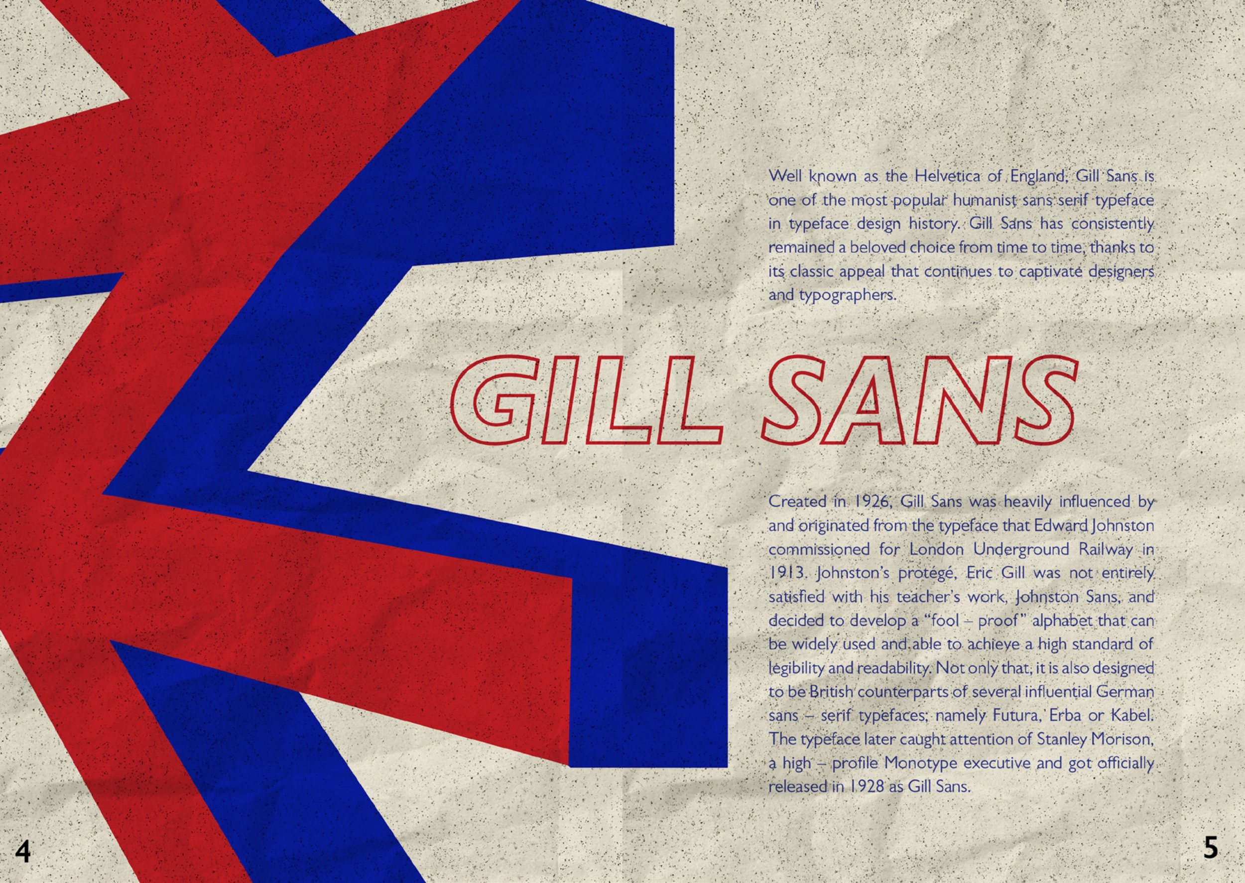
This is my very first time creating a zine in general, and a zine about a typeface in specific. Before developing this project, I have come across Gill Sans in numerous branding. However, it was not until now that I realized Gill Sans was behind those iconic brandings, including the famous Underground visual identity transportation across Britain. Because of that, I think incorporating this theme as the main concept of my zine will reflect the true original essence of Gill Sans.
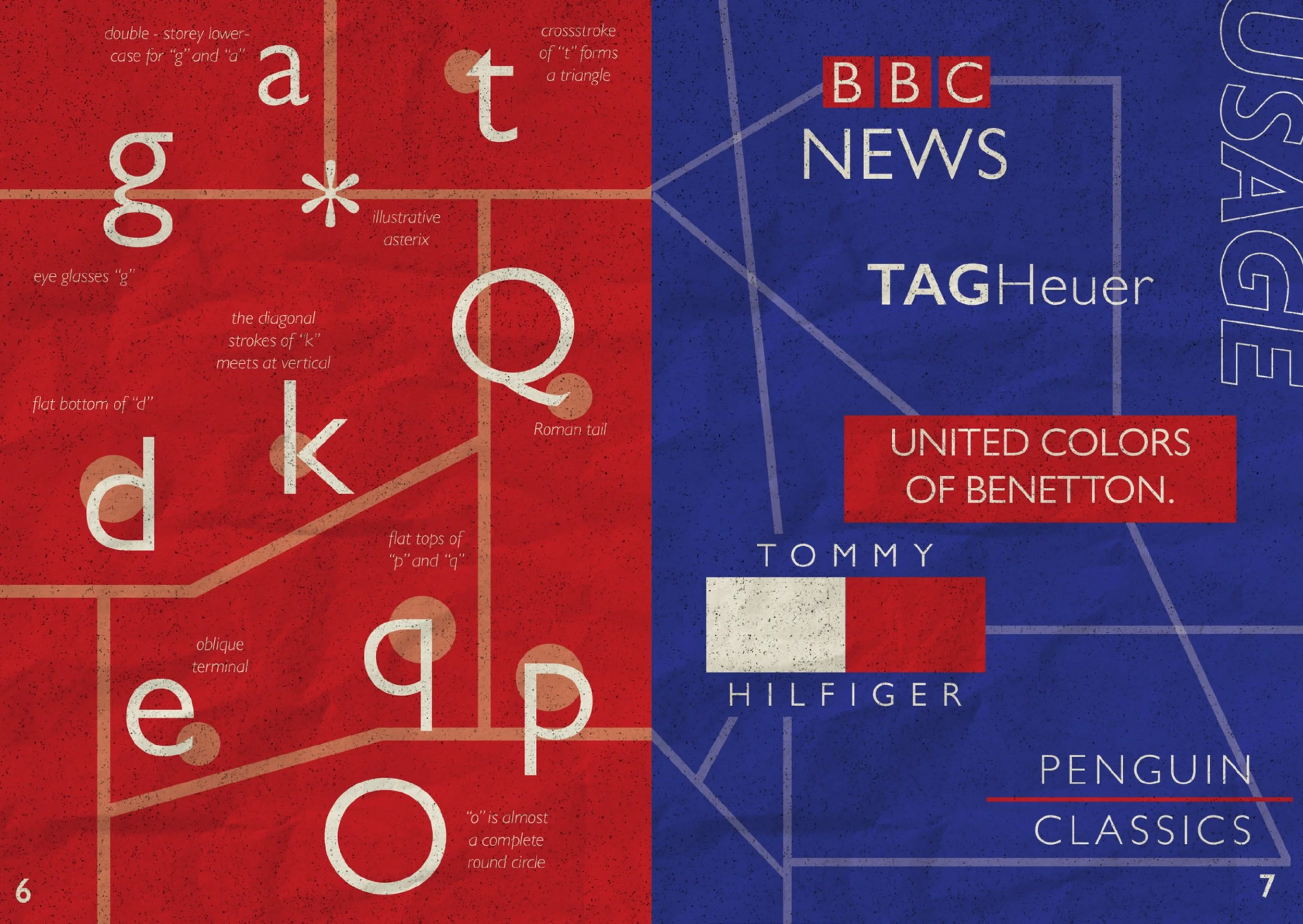
The Typeface
I saw a huge potential with much spaces of opportunities to play around with the typeface, by slicing and detaching different parts of different characters. I will also use Gill Sans as my one and only typeface throughout the zine, since there is a diverse array of weight and height within Gill Sans itself. Not only that, it also provides a clean, friendly and human look, making the zine more appealing and comprehensible.
For each of the section titles, I used heavy italic font with no fill and significant strokes, and for body text, I used regular font. I also highlighted important phrase of body text in bold, making it stands out and catching attention from readers.


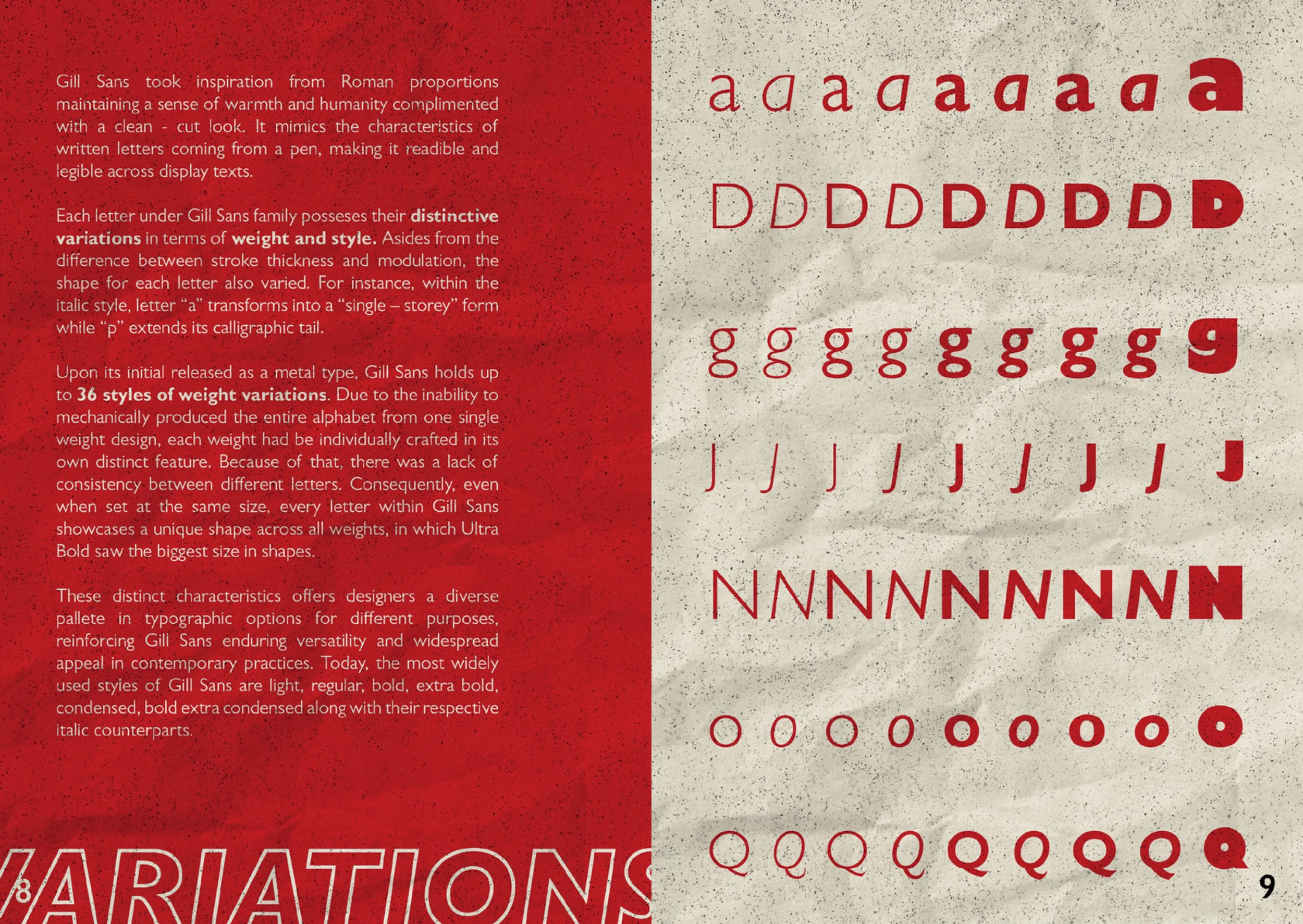
The Colors
The two iconic primary colors that are used were red and blue, reflecting the original color of the British underground system signages. These two colors are constrastive and are complementary. Tints are experimented in a few of pages, illustrating the train lines as if they are illustrated on the map. I chose a beige, off–white tone for stock colour, serving as an accent to further compliment other design elements. I also implement a rough, grainy overlay layer to imitate a vintage, worn-out booklet taken from the train station the past.